Why
We aim to simplify and streamline the event booking process, reducing the time it takes for users to schedule with us. With schools facing staffing shortages, our goal is to alleviate the burden on front desk staff by enabling users to book seamlessly and independently.
Goal
Decrease event booking time and less stress on the tenant admin.
Competitive Research
AirBnB
Pros: The map is intuitive and user-friendly, with clear and specific information. It effectively uses visual hierarchy to guide users.
Cons: The design is heavily image-based, which can feel overly specific. Clicking on the map or images triggers a full-screen view, potentially leading to excessive back-and-forth navigation for users.;
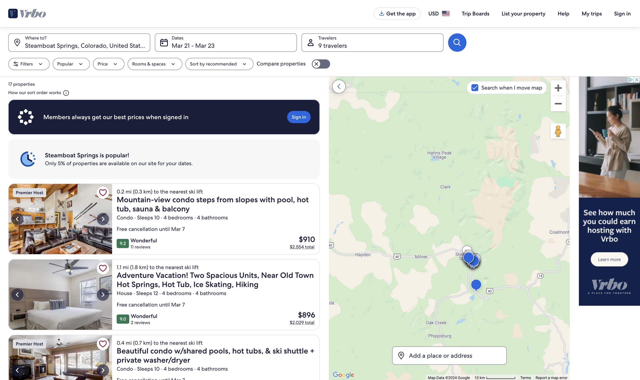
VRBO
Pros: Aligns well with our users' needs. The list view effectively presents information, and the suggestion of “0.1 miles to the nearest ski lift” is a nice touch that can be customized for the user.
Cons: Clicking into full view makes navigation cumbersome, as there’s no easy way to switch back and forth. Additionally, the details could be better organized for a more cohesive experience
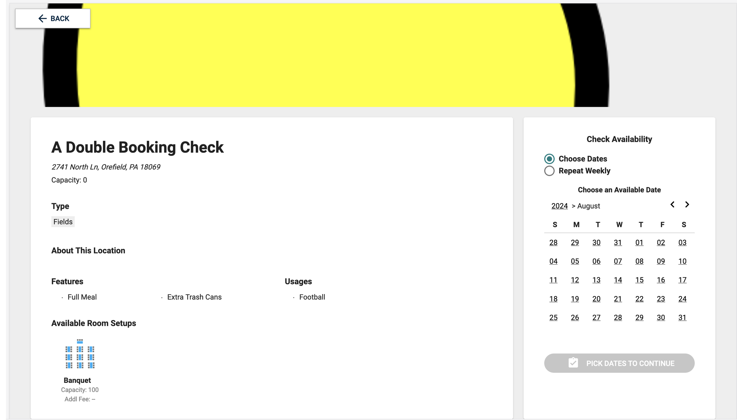
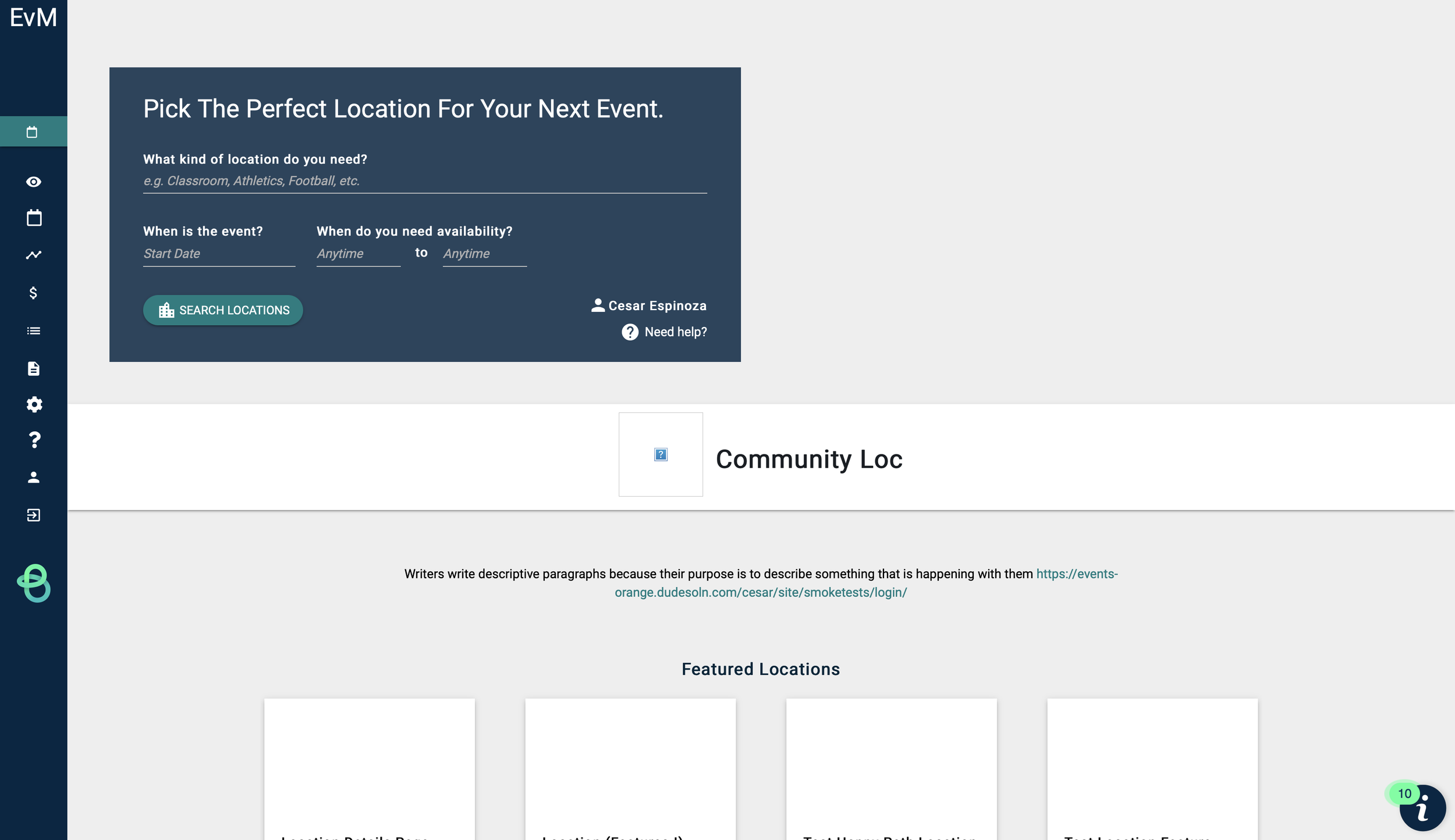
Current Event Booking Form


Survey Results
we sent a survey out to get quick results, we had about 63 users take the interview.
Question:
What would you like to search by?
Results:
•Location: 30
•Dates: 8
•Building/Campus: 6
•Availability: 5
•Activity Type: 4
•Space Size: 3
•Features/usage type: 3
Quotes:
•“Looks good only thing I would ask if the location bar will have drop down choices or will it be generated as I type in the search bar? “
•”The search-by area would be helpful if there are a lot of locations from which to choose. Otherwise, I'd probably prefer to click on a location on the map”
Question:
What do you think about new community home page?
Results:
Like: 30 (possibly more) – good news is it was a lot of positive feedback
Dislike: 4
Don’t need map: 8
Quotes:
•“I like it better than the current home page because the locations are easier to see, rather than the information and filters on the top and left side of the current page. I do not care for the map though.”
•“This appears to be MUCH better as far as choosing a location. The current way of scrolling through rooms/locations is VERY difficult when you have facilities listed for a school district.”
•“This looks so much better!”
Question:
What do you think about the 11 facilities showcased here on the map?
Results:
•Good: 26
•Fine: 7
•Confusing: 5
Quotes:
••“I like this! This is a great way to expand info without it being overwhelming. I also like that the school's name is close-by in a lighter font. ’’
•“This is not immediately clear. I don't think it needs the number”
•“does that mean 11 locations found? Not sure what that means”
•“It would be nice if the map zoomed in to show the 11 locations, similar to how Zillow does on their site.”
Question:
Would you like to have options such as “next available” on this page?
Results:
•Good: 49
•Fine: 13
•NA: 10
Quotes:
•Next available could be useful for those scheduling last minute meetings. I scheduled mostly a year or more out so not very useful for my type of work.
•Ick. Don't do that. It may be "available" tomorrow but ain't no way they are able to rent it tomorrow! We all have different policies in place for approval and time required prior to rental, so that is not very useful (unless we can put a "X days from now" default on it... and if we could prevent them from requesting within a window x days from today, that would actually be fabulous)
Question:
Is the calendar useful?
Results:
•Yes: 69
•No: 1
Points to takeaway: show available times
Quotes:
•I think so. It provides and "at a glance" without having to really dive into a space. If you know its already booked up for the day, then you can move on to the next space.
•Like this part as you can see at a glance availability.
•I like it a lot. Sometimes I bounce back and forth between days trying to find space but this visual makes it easier and faster to find openings.
Old Designs
Here is what I originally thought the landed page would look like for mobile
I wanted to make it simple with one search bar, but however after client interviews clients would have to take multiple dates to put their dates and times in which is why I updated the design to include that.
After the client filtered from the landing page, these were supposed to be the results.
I really liked how it looked, HOWEVER there are quite a few clients that don’t rely on images on their site and don’t have the images uploaded. Therefore something like this style wouldn’t benefit them.
Here is my original screen for the landing page for web.
I had available in the top right, but thanks to the survey results I decided to go with “next available” vs “available” as people said they didn’t see that useful and would hope after inputting fields that the only locations that were to show up should be available.
Final Designs
Here is what I learned
Include “next available”
Featured spaces should keep the current design and be at the top
don’t rely heavily on images as about 50% of clients use our program internally and don’t use images.
Keep the slideout view vs full page to provide an easier view for clients to switch back and forth


